 Company
Why our wheels are Pantone 382 C

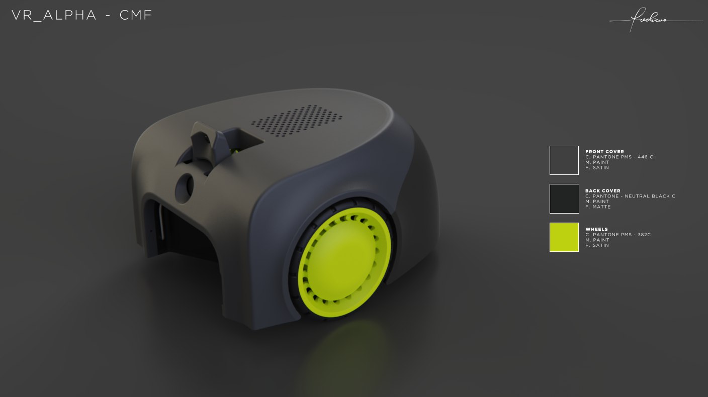
When you see a yellow-green wheel rolling across a tennis court, your eye reads it as "tennis ball." That's the only choice we wanted designers and customers to make about our colour. The brief was: find a chartreuse that feels like a tennis ball without making the product look like a toy.
That's harder than it sounds.
The candidates
I started with twelve Pantone chips. Five were classic "tennis ball" yellows from sportswear palettes. Four were brighter, more electric chartreuses you'd find on hi-vis safety apparel. Three were muted, almost olive greens.
We taped each chip to a sample wheel and photographed it under three lighting conditions: indoor LED, midday daylight, overcast afternoon. We then mocked up the robot with each colour on the wheels only — the body stayed Pantone 446 C (the warm grey-black we use across the product) and Pantone Neutral Black C on the back.
What we learned
Two things made Pantone 382 C win:
1. It reads "tennis" without reading "kids' toy." The brighter chartreuses looked great in a colour swatch but slipped into "playground equipment" the moment they touched the matte grey body. 382 C is dark enough — there's just enough green in it — that the product still feels like a piece of engineering, not a toy.
2. It photographs well at every time of day. The brighter alternatives blew out in midday sun. The muted ones disappeared in low light. 382 C holds its character.
One small surprise
The colour is psychologically related to the ball, but it doesn't actually match a tournament tennis ball. ITF-approved balls are closer to Pantone 380 C — slightly more yellow, slightly less green. We tried 380 C. It looked like an actual ball, which made the wheel look like the robot was eating its own dinner. 382 C is intentionally a step away.
It's a small detail. But it's the small details that make a piece of consumer hardware feel considered.
— Ernesto